


Before we dive into the kaleidoscope of hotel interiors, let’s pause to appreciate the science behind color psychology. Every color has a unique wavelength and energy, which can influence our mood and behavior.
Blue. Often associated with calmness and serenity, blue can lower blood pressure and create a soothing environment.
Red. The color of passion and energy, red can increase heart rate and spark excitement.
Yellow. Reminiscent of sunshine, yellow can brighten one’s mood and stimulate creativity.
Green. The hue of nature, green can promote relaxation and a sense of healing.
With this knowledge in hand, let’s explore how the hospitality industry uses color to curate guest experiences.
First Impressions: The Hotel Lobby
Entering a meticulously crafted hotel, the initial experience unfolds in the captivating embrace of the lobby. The focal point is the carefully curated color scheme that orchestrates a symphony of emotions. Radiant yellows extend a spirited greeting, fostering lively conversations and revitalizing fatigued travelers. This vibrant hue creates an ambiance that resonates with positivity and enthusiasm, setting the stage for an uplifting stay.
Contrastingly, earthy greens and soothing blues weave a tranquil narrative, embracing visitors in a calming atmosphere. These colors are a sanctuary for those in search of repose after a prolonged journey. The natural tones evoke a sense of serenity, inviting guests to unwind and recharge amidst the well-thought-out design.
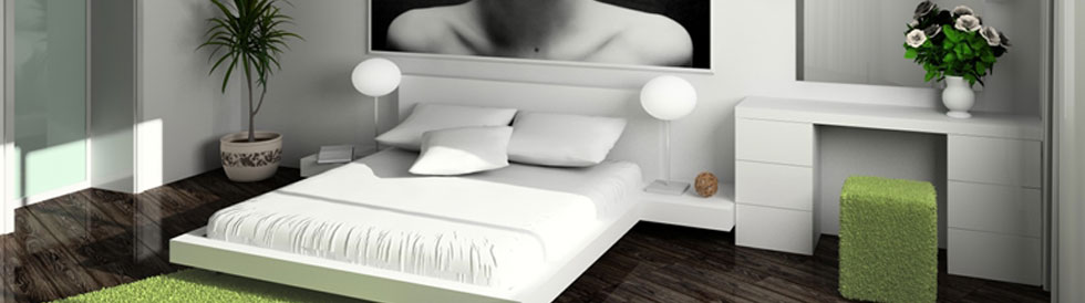
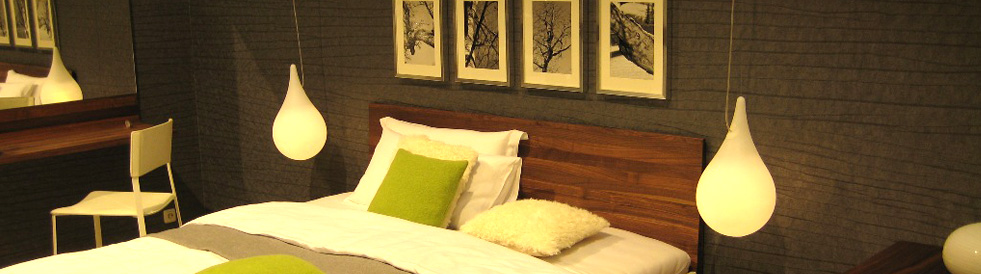
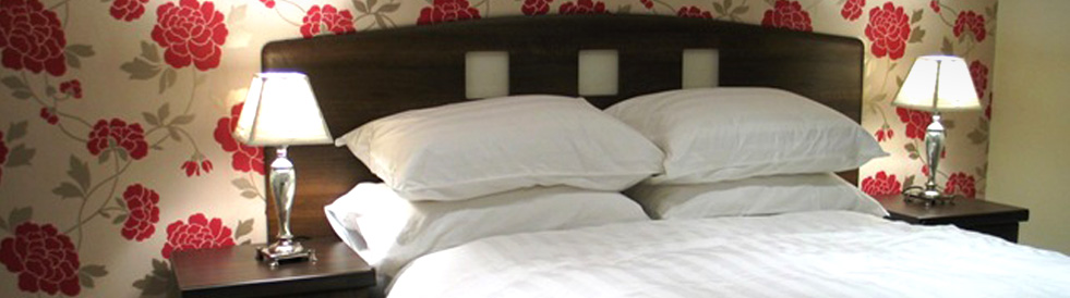
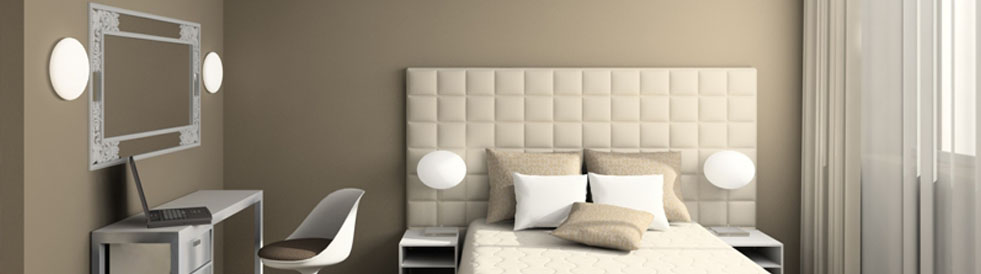
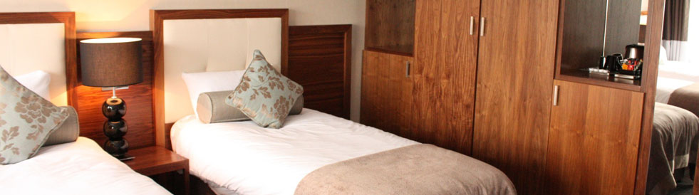
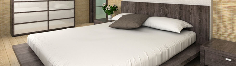
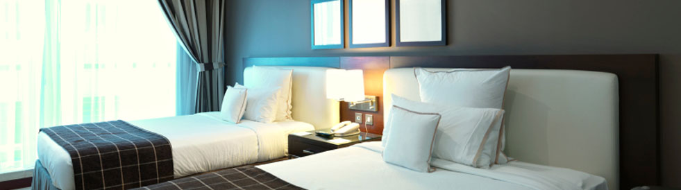
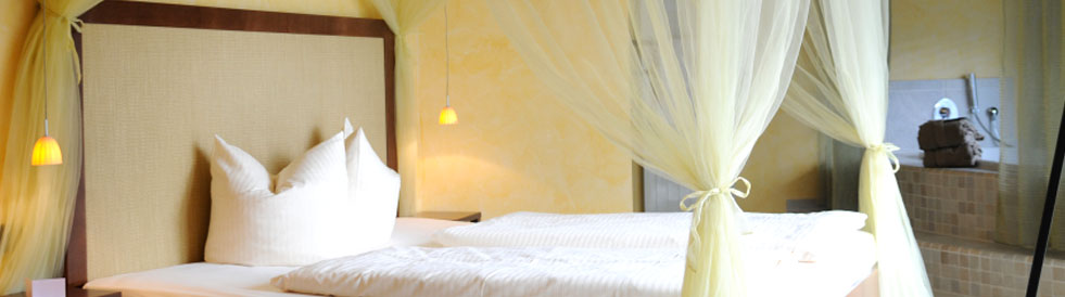
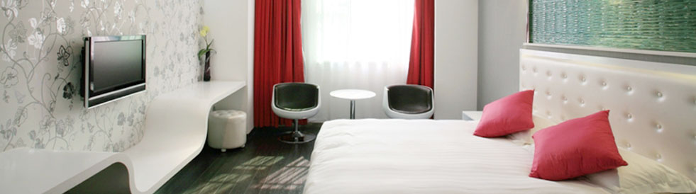
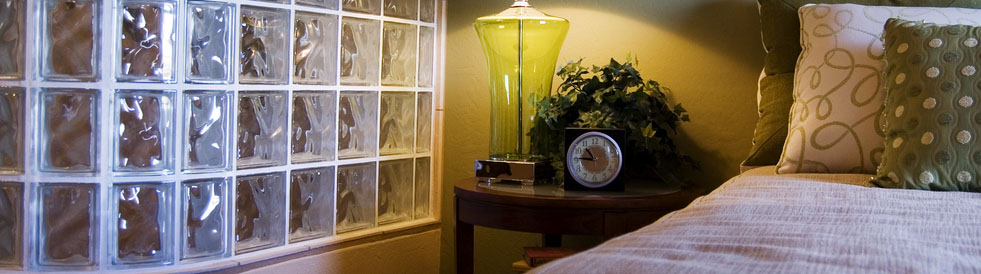
Guest Rooms
A subtle mastery of color unfolds, transforming these spaces into serene retreats. Delicately chosen hues offers a nuanced experience to guests. Muted tones and pastels dominate, weaving a tranquil cocoon conducive to restful sleep. The gentle palette fosters a peaceful atmosphere, creating a haven where relaxation takes center stage.
Adding a touch of warmth, hotels often incorporate bursts of color, such as terracotta or amber, through carefully selected accent pieces. These elements infuse a sense of homeliness and extend a warm invitation to guests, making them feel truly welcomed.
Whether enveloped in a coastal ambiance with cool blues and sandy tones or immersed in an urban chic setting adorned with sleek blacks and grays, each room becomes a canvas telling a unique narrative.
Hotel Restaurants
Color plays a vital role in enhancing the gastronomic experience, aiming to captivate both mood and appetite. Strategic use of color becomes an essential ingredient, contributing to a vibrant and inviting atmosphere within the restaurant. Reds and oranges take center stage, stimulating hunger and excitement among diners. These warm, energetic tones infuse the dining space with liveliness, creating an ambiance that complements the culinary delights being served.
A conscious integration of greens is observed in areas that emphasize healthy eating options. Green hues symbolize freshness and vitality, aligning seamlessly with the promotion of nutritious choices on the menu. This thoughtful use of color communicates a commitment to well-being and a wholesome culinary experience.
Spas and Wellness Areas
Dominant blues and greens take center stage, echoing the serenity of water and the calmness of lush vegetation. These cool, soothing tones create an ambiance that aligns with the restorative nature of spa experiences. The blues evoke a sense of calmness, while the greens signify the rejuvenation found in the midst of nature. Together, they establish a harmonious palette that envelops visitors in a cocoon of relaxation.
Complementing this tranquil foundation, neutral palettes come to life, adorned with occasional floral tones. This combination invokes a sense of purity and cleanliness, enhancing the overall spa experience. The neutrality serves as a canvas for the occasional bursts of floral hues, symbolizing the renewal and blossoming associated with wellness and self-care.
In this carefully orchestrated symphony of colors, hotel spas transcend mere physical spaces, becoming immersive retreats where the visual aesthetics harmonize with the therapeutic elements, offering guests a holistic and rejuvenating journey of the senses.
Conference Rooms and Ballrooms
In spaces dedicated to concentration and productivity, such as conference rooms and ballrooms, the strategic use of color becomes a crucial element in keeping attendees actively engaged.
A splash of orange strategically placed to ignite creativity and foster lively discussions. This vibrant hue serves as a catalyst for dynamic interactions and free-flowing ideas. The warmth of orange infuses energy into the room, encouraging a collaborative and innovative atmosphere.
Blue tones take the forefront to promote focus and facilitate clear thought processes. Blue, with its calming and stabilizing properties, creates an environment conducive to concentration and effective communication. Whether in the subdued backdrop or as accent elements, blue instills a sense of order and reliability, contributing to a professional and organized setting.
Unique Furnishings and Decor
Within these color-themed environments, the furniture and decor bring their own stories, drawing on a range of shades and materials to complement the hotel’s motif. Intricately patterned rugs, plush velvet armchairs, and vibrant art pieces can all serve as vehicles for color, adding depth and character to each room.
An Integrated Approach to Color and Experience
The strategic application of color in hotel design it’s an integral component of the guest experience. From the moment you enter the lobby to the time you retire to your room, every hue you encounter is a deliberate piece in a sensory puzzle, designed to evoke a specific emotion, from tranquil repose to energetic engagement.
The colors chosen are brushstrokes in an intricate painting of hospitality, each with the power to touch your mood, shape your perception, and leave a lasting memory of your visit.
Hoteliers and designers collaborate in a dance of creativity, utilizing the palette of emotions that color can provide to ensure your stay is truly unforgettable. Next time you walk into a hotel, take a moment to appreciate the hues around you, for they are there by design, gently guiding your experience from the visible spectrum into the felt presence.